


Weekend Project: Lemonade Stand
a simple, foldable, diy that requires no power tools

This morning, my son complained that his current lemonade stand (a one-foot tall box with a cardboard sign in front) wasn’t eye-catching enough. “Can we build one?” I think he’s figured out I’m a sucker for projects.
I worked out a design on graph paper, and after some puzzling, figured out a way to build it so that it would require no power tools, and a way to divide the board with a minimum of cuts and no waste. We headed down to the lumber yard (in this case, Lowe’s, a big-box store) and picked out a sheet of 1/2 inch plywood sub-flooring (the cheap, rough stuff).


I marked it at 3’ and 6’ and took it to the cutting area. The man asked me how many cuts and I told him three. At Lowe’s, they don’t like to be cutting out pieces for a project (which is precisely what I was asking him to do) but if you keep it to a minimum I have found they are generally willing. He cut the board twice, making two 3x4’ pieces and one 2x4’ piece. I then took one 3x4’ piece and marked it at 2’ on the four-foot long side. Here is a drawing of how the whole 4x8’ board was divided:
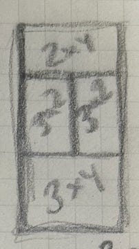
He made the final cut and I thanked him. Next, we picked out hinges then headed over to the paint department, where we chose colors for the front of the stand, and purchased a selection of 8oz. paint samples to do the job. We could have mixed the paints from tubes of acrylic that I have at home, but when you are making a sign, sometimes it is handy to use paint chips to figure out a color palette, and stick to that. I had white paint on hand at home to gesso the boards (meaning, give them a base coat of paint).


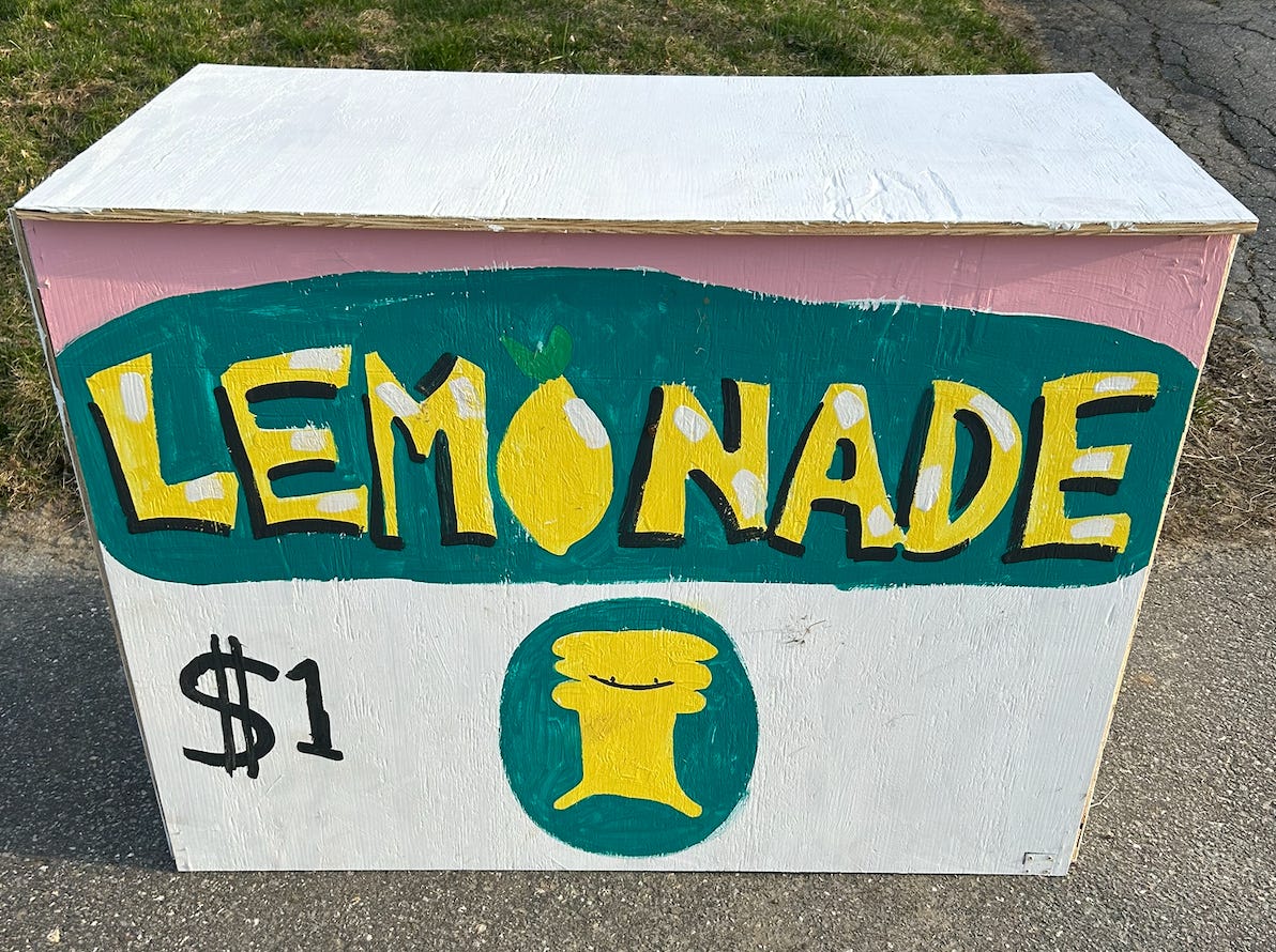
Back at home, here is a gallery of the painting process. For the lettering, I started with the two letters in the middle, then the two letters in the middle of the left and right sides, then filled in the remaining letters. When you are making a sign, this is a way to make sure you are allowing roughly equal room for each letter.


Lettering can be fun - if you mess up you can always paint over it, and you can tighten it up step-by-step by adding background color, outlines and highlights. When adding shadows, just remember to pick two sides of the letter (here I chose left and bottom) and keep it consistent for each one.
We let that dry, then turned it over to add the hinges. It wasn’t hard to screw them in manually with a screwdriver, but we also used a power drill, to get the project completed more quickly. My son wanted to do some drilling, so I screwed the screws in part-way, and let him drive them in the rest of the way for practice. I had to remind him several times to pull his hair back (it could get caught in the drill) - this is something to bear in mind when kids want to work with power tools: the safety patrol is your duty, because it will probably not be their primary focus.


I had intended to set the tabletop an inch or so lower than the top edge of the sign, to create a lip, but hadn’t taken into account that whatever the top rested on would prevent the stand from folding away flat. So after giving it a little thought, decided to keep it simple by angling the sides in a bit and resting the top on top of them like so:


You might not want to rely upon it in a high wind, but you probably don’t want to be out selling lemonade in a high wind anyway. The heavy weight of the 1/2 inch plywood makes it sturdy.
Here is the final product (minus whatever extra paint or improvements we may yet add). My son painted the lemon in the word “lemonade”, the yellow of the letters, the price and the little character at the bottom. When kids help with signs, let them make their artwork, then you can tighten up the edges, if you want, by painting in a background and adding shadows and/or highlights. Don’t make it too neat - it’s a kid’s lemonade stand, after all!
Excellent!